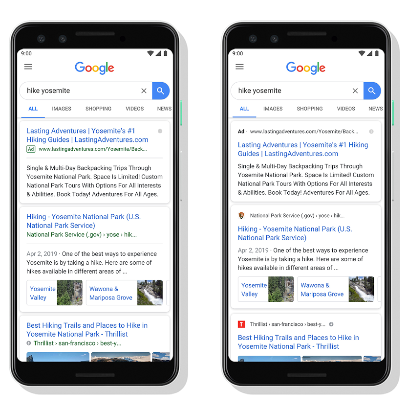
Over the past month, Google has been showing small icons for each of the organic search results displayed on mobile and tablet screens. The new look results page is designed to make it easier for searchers to see the sites that are appearing in the results on a smaller screen, and also gives companies a chance to show their branding alongside their listings.
Google introduced this new search layout at the end of May and said that the new design can help a website’s branding be front and center, potentially helping searchers to better understand where the information is coming from and what pages have the results they are looking for.
The example below is the one provided by Google and shows the original layout on a mobile screen (left) compared to the new design with the small icons and website name listed about the results (right):
With this new look, the name of the website and its icon appear at the top of the results card to help anchor each result, so users can more easily scan the page of results and decide what to explore next.
For businesses, it will be important to check how your branding is being shown in the small icon, but this should reflect the favicon image that most websites will use and show in the browser or bookmark bar. There is more info about setting up the favicon and link on a website here.
Google says that the following guidelines must be followed in order to show the favicon next to your search results in this new design. However, they also say that a favicon isn’t guaranteed to show in the search results even if all guidelines are met:
- both the favicon file and the home page must be crawlable by Google (that is, they cannot be blocked to Google)
- the favicon should be a visual representation of your website’s brand, in order to help users quickly identify your site when they scan through search results
- the favicon should be a multiple of 48px square, for example: 48x48px, 96x96px, 144x144px and so on. Any valid favicon format is supported and Google will rescale your image to 16x16px for use in search results, so make sure that it looks good at that resolution
- the favicon URL should be stable (don’t change the URL frequently).
It’s possible that this new look for the mobile results will eventually appear on desktop results as well so make sure your site is being represented in the best possible way to help it stand out in the results and increase the chances of attracting a click.
Google’s aim with this new look is to make results clearer as well as to enable more action buttons and helpful previews to be added to the results on the search page, so that users get a better sense of the web page’s content with clear attribution back to the source.
If you’d like more information about these new look results and setting up the favicon for your website, please get in touch.
